OUR APPROACH
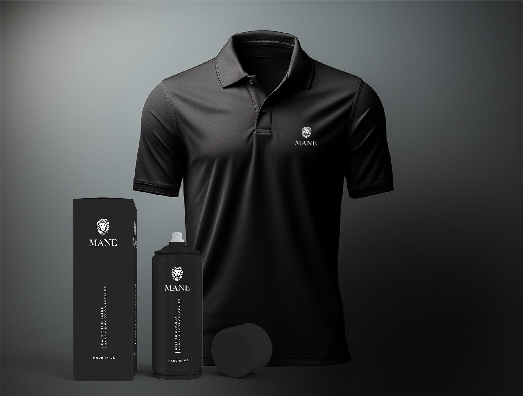
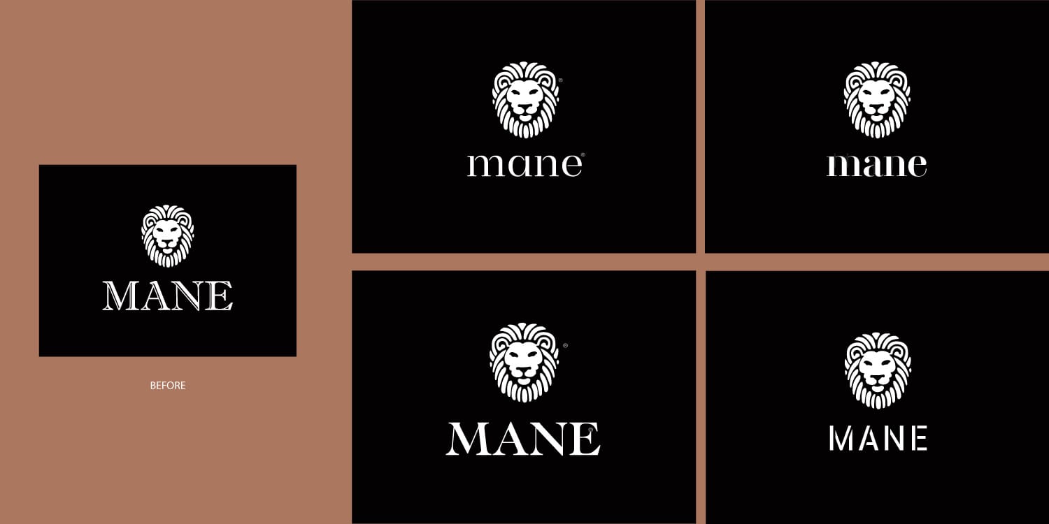
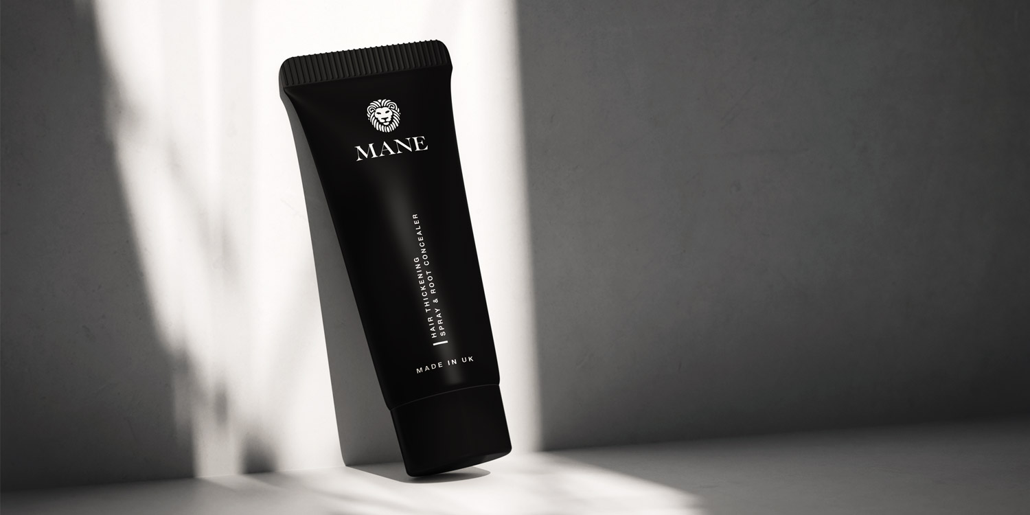
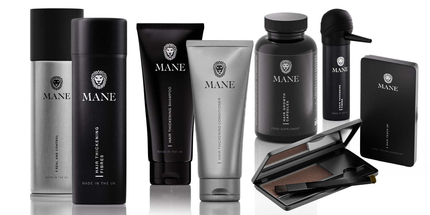
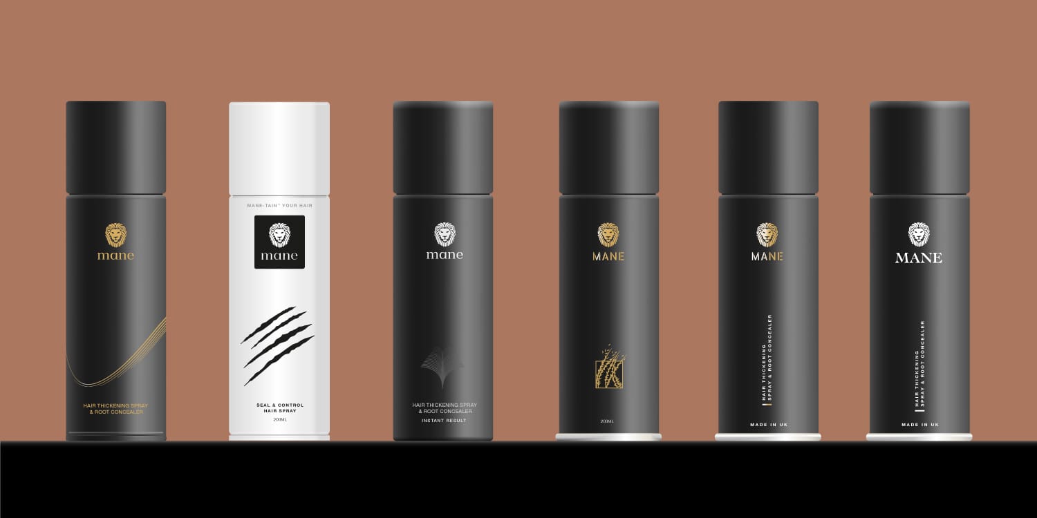
We knew that updating such a well-established brand wasn’t going to be easy – it’s like convincing someone to get a new haircut after rocking the same mullet for 40 years. But we were up for the challenge. We approached the project with a balance of respect for Mane’s history and excitement for their future. First, we created several logo and packaging design options, showcasing how their branding could evolve while keeping the spirit of their 80s origins alive. We knew the nostalgia was strong, but we also wanted them to see what was possible – and after some deliberation, the client saw the potential too.
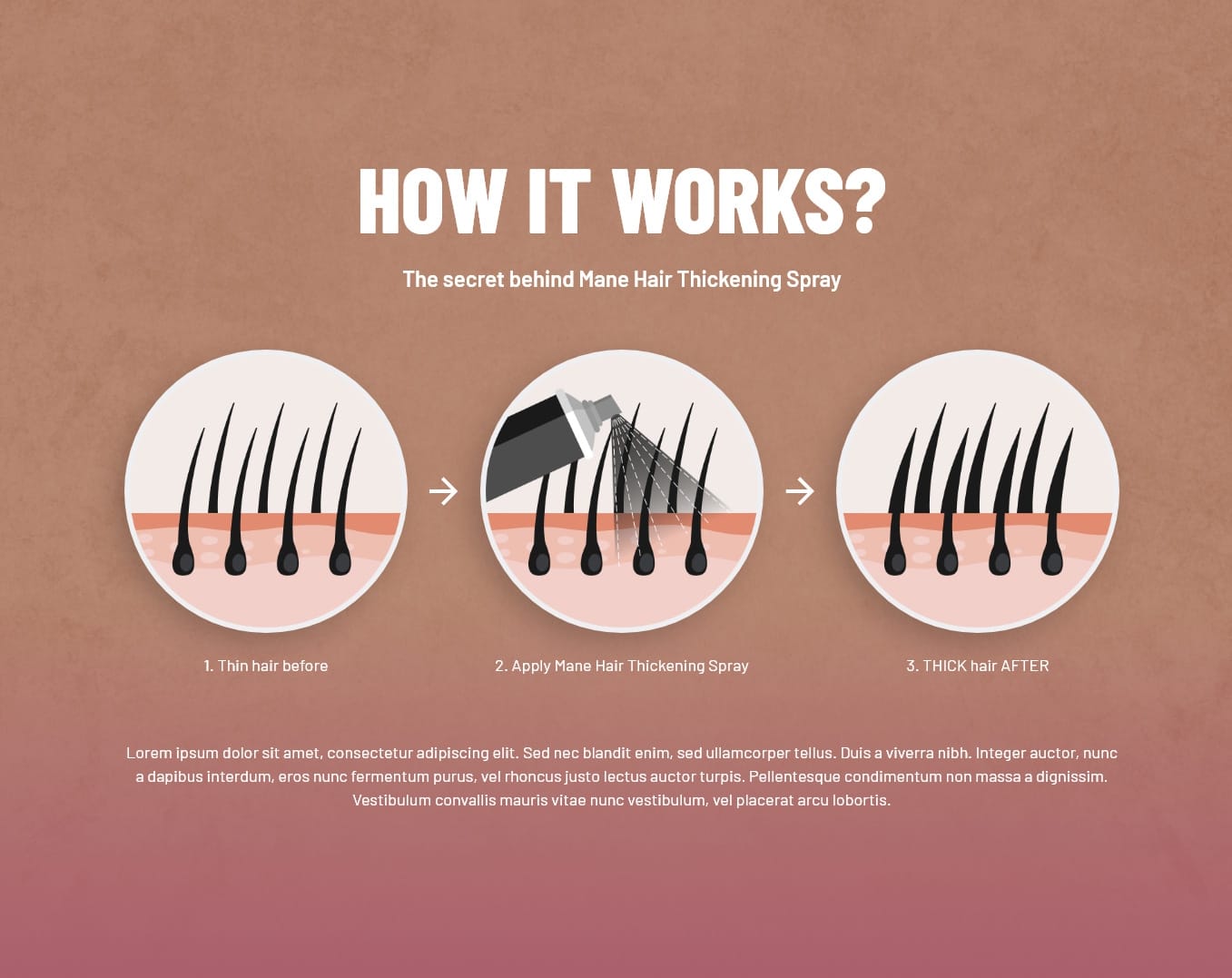
For the website, we gave it a complete makeover, making it sleek, modern, and user-friendly, with all the bells and whistles necessary to attract new customers while keeping loyal ones engaged. And of course, we ensured the online experience was as smooth as their hair-thickening spray.
