General enquiry
West Road Dental

West Road Dental

Branding, Web design

Website Refresh

THE CLIENT

West Road Dental Practice is a Midlands based professional and friendly dental practice serving the Oakham, Rutland and Leicestershire area. As well as top level dental care, they also offer a range of cosmetic treatments for the teeth and face.  They believe that your smile and the face you present to the world is very important for first impressions. Well established over several years, their offering has grown to reflect the current world and the type of treatments that people now wish to have.

THE ISSUES

  • The whole look of the business was outdated and no longer reflected who the company now is or the products on offer.
  • The old web site did not fit the current marketplace.
  • The SEO of the old site was good.
  • The old web site was difficult to navigate, and some key services were not really highlighted.
  • The old web site had not evolved with the business and the customer was unable to add any new content.
  • The old web site was not attracting new clients.
  • The photography was dated and unappealing.
  • The copy was no longer current.
Launch live site

From the project’s inception, it was evident that design would serve as the foundational pillar. We embarked on a comprehensive re-design, prioritizing the enhancement of user experience as a paramount objective.

We meticulously refined the West Road Dental brand, imbuing it with a heightened sense of prestige. This accomplishment was, in part, realized through the integration of West Road Dental’s exquisite in-house photography.
THE SOLUTIONS & RESULTS

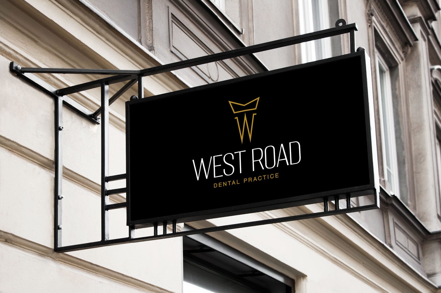
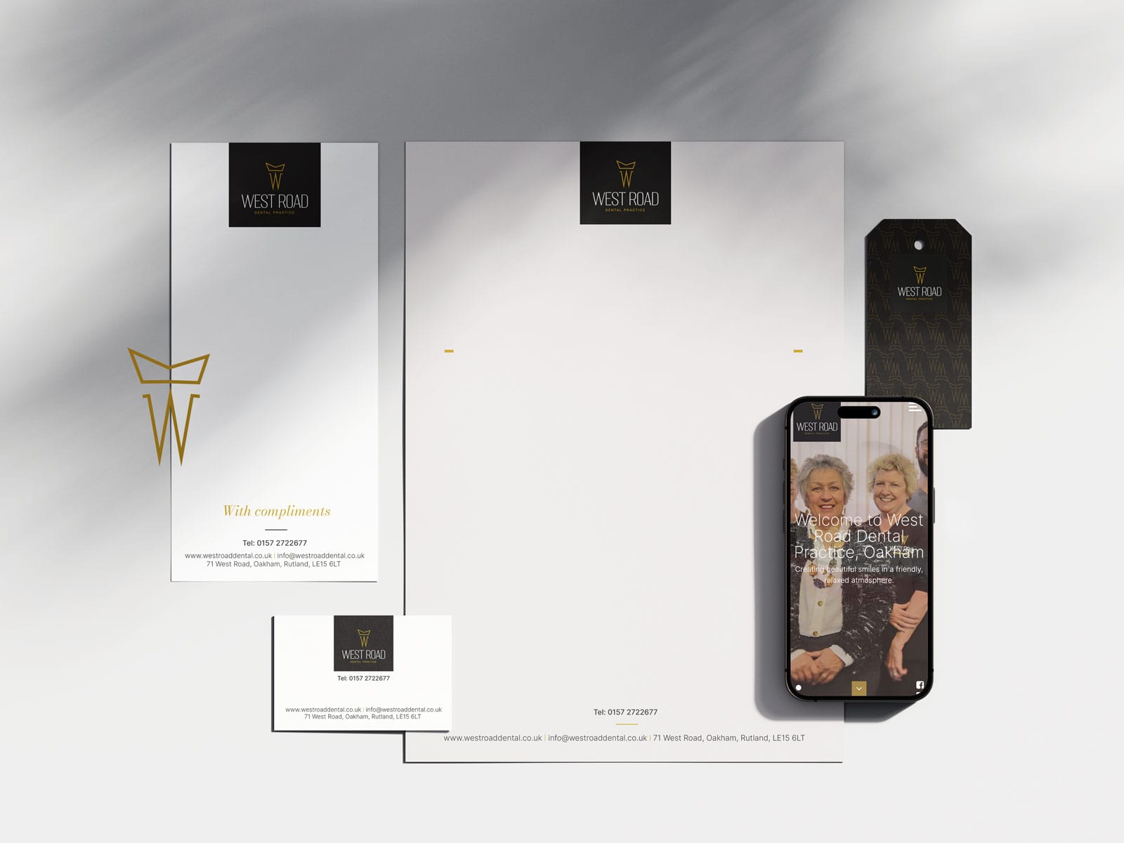
  • The first thing Rak Design did was to focus on updating the company image with a new look logo that is appropriate to the industry West Road Dental operates in, but also reflects the professionalism and modern approach to dentistry that is an integral part of who the company is.
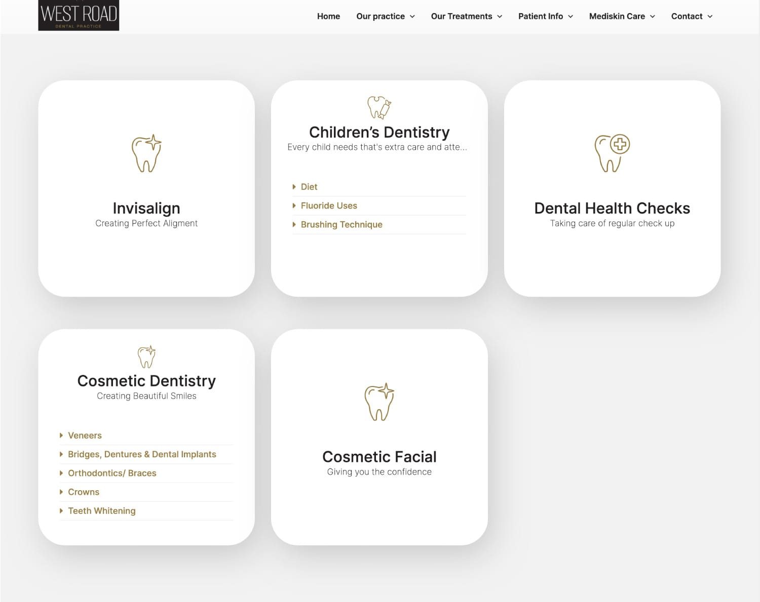
  • A brand-new web site was created with a new layout that highlights the key offerings of the business, is super easy to navigate and the clients can find what they are looking for with a minimum number of clicks.
  • New photography was done of all the staff proudly wearing the new company logo and engaging with clients in a professional and caring manner. The images are re-assuring and give the web site a lovely human feel.
  • New copy was written to reflect the more modern looking web site but still maintaining the SEO from the previous site. The new copy is also much more informative about the new services and products that the company has to offer.
  • The new web site also uses a content management system that the client has access to, so they can update certain areas and keep the web site and blog current with any new information or treatments. This is a really key point in giving the client control of what the web site says to their clients.

The result is a fresh looking, professional but inviting web site that is super easy to navigate, informative and reassuring. Since the new launch, the web site is generating many more new leads and actual client conversions.

Services: Search Engine Optimisation (SEO)Web Design,

View all projects