- Home
- About
- Our work
- Services
- submenu
- Professional Web Design Agency in Northamptonshire
- White Label Website Development for Agencies
- E-commerce – Magento Development
- eCommerce – BigCommerce Developers
- E-commerce – Shopfiy Developers
- WooCommerce Developer UK
- Content Creation
- Hosting
- Search Engine Optimisation (SEO)
- PPC / Adwords
- Migrations
- Maintenance
- Training
- Trusted Experts for Magento Development London
- Your Trusted Web Design Experts in London
- Trusted Web design company Milton Keynes
Graphic Design Jargon
Graphic Design Jargon
Today’s topic – Graphic Designer Jargon
Struggling to keep up with the ‘jargon’ being said by your design agency and worried your missing bits? Well not to worry we have created this article just or you. This article selects the 10 most common words used by designers. You should be able to use this article to decipher your designers next email.
Let’s begin:
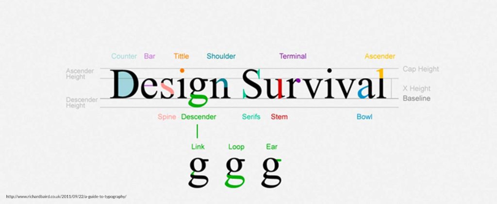
01 Typography
The way type is arranged in a legible and appealing way. Typography usually concerns the design and use of various typefaces in a way that helps to better visually communicate ideas.

02 body copy
The main text on your website, book or publication. Any written content – even this is body copy.
03 Display type
Typography that is used to grab attention and break up text. Think of movies title posters, website headings and newspaper headlines.
04 Hierarchy
The visual arrangement of design elements that signify importance. Think of this like a newspaper – large bold heading at the top followed by subheadings and then body copy.
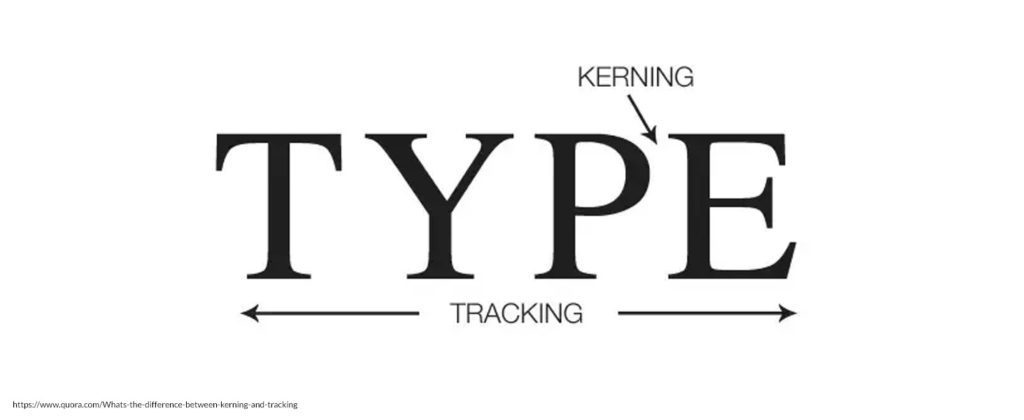
05 Kerning
The adjustment of space between two characters in a word. Kerning is s common design term and usually aims to achieve a more proportional and pleasing balance of space between each character.

06 Tracking
Tracking is the space between letters. When we track bodies of text, we are adjusting space between every letter in a word in order to change the density or appearance of a large block of words. Tracking shouldn’t be confused with kerning, which concerns the adjustment of space between individual pairs of letters.
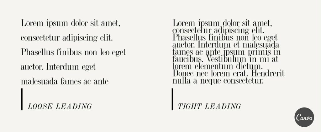
07 Leading
Pronounced ‘ledding’, leading refers to the space between lines of type. Overly tight leading can cause tension and overlap, making the content unreadable, and too-loose leading can equally make the type appear disjointed, so we usually try to find a nice balance between the two.

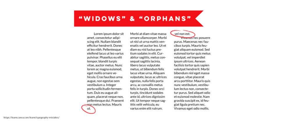
08 Orphans and Widows
This refers to the words or short lines that appear by themselves at the top or bottom of a column of type. It’s always a good idea to check over your body copy before finishing up, and remove these when they appear.

09 CMYK & RGB
CMYK or ‘Cyan, Magenta, Yellow, Key’, is a color model that is used for print purposes. CMYK is a subtractive color, this means that we begin with white and end up with black. So, as we add more color, the result turns darker.
RGB or ‘Red, Green, Blue’ is a color model that is used for on-screen purposes. RGB is an additive color, meaning that when mixing colors, we start with black and end up with white as more color is added.
10 Pantone
The ‘Pantone Matching System’ is a standardized system of colors for printing. Every Pantone shade is numbered, making it much easier for people to reference and identify exact shades of color.
For other client-agency help sheets please click here.
Rak Design (UK) Ltd is a creative graphic design & web design agency, based in Northamptonshire, delivering website design and development, digital marketing and corporate branding services that drive tangible and measurable results for your business. If would like to see our portfolio and are interested please do not hesitate to call the team on 01933 678 522 or complete our online contact form and we’d be happy to help.
GDPR Compliance Alert – Key points businesses must know to stay compliant with new GDPR regulations.
RELATED ARTICLES
General enquiry
We use cookies on our website to give you the most relevant experience by remembering your preferences and repeat visits. By clicking “Accept All”, you consent to the use of ALL the cookies. However, you may visit "Cookie Settings" to provide a controlled consent.Manage consentPrivacy Overview
This website uses cookies to improve your experience while you navigate through the website. Out of these, the cookies that are categorized as necessary are stored on your browser as they are essential for the working of basic functionalities of the website. We also use third-party cookies that help us analyze and understand how you use this website. These cookies will be stored in your browser only with your consent. You also have the option to opt-out of these cookies. But opting out of some of these cookies may affect your browsing experience.Necessary cookies are absolutely essential for the website to function properly. These cookies ensure basic functionalities and security features of the website, anonymously.Cookie Duration Description cookielawinfo-checkbox-analytics 11 months This cookie is set by GDPR Cookie Consent plugin. The cookie is used to store the user consent for the cookies in the category "Analytics". cookielawinfo-checkbox-functional 11 months The cookie is set by GDPR cookie consent to record the user consent for the cookies in the category "Functional". cookielawinfo-checkbox-necessary 11 months This cookie is set by GDPR Cookie Consent plugin. The cookies is used to store the user consent for the cookies in the category "Necessary". cookielawinfo-checkbox-others 11 months This cookie is set by GDPR Cookie Consent plugin. The cookie is used to store the user consent for the cookies in the category "Other. cookielawinfo-checkbox-performance 11 months This cookie is set by GDPR Cookie Consent plugin. The cookie is used to store the user consent for the cookies in the category "Performance". viewed_cookie_policy 11 months The cookie is set by the GDPR Cookie Consent plugin and is used to store whether or not user has consented to the use of cookies. It does not store any personal data. Functional cookies help to perform certain functionalities like sharing the content of the website on social media platforms, collect feedbacks, and other third-party features.Performance cookies are used to understand and analyze the key performance indexes of the website which helps in delivering a better user experience for the visitors.Analytical cookies are used to understand how visitors interact with the website. These cookies help provide information on metrics the number of visitors, bounce rate, traffic source, etc.Advertisement cookies are used to provide visitors with relevant ads and marketing campaigns. These cookies track visitors across websites and collect information to provide customized ads.Other uncategorized cookies are those that are being analyzed and have not been classified into a category as yet.WhatsApp us
- submenu


