- Services
- Web Design & Development
- Ecommerce Development
- Creative Branding
- DevOps
- Digital Marketing
- Mobile App Development
- The Team
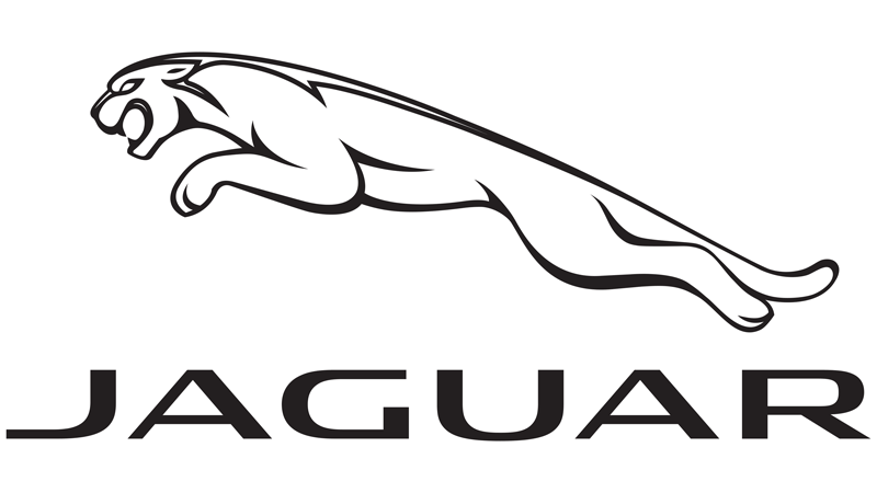
Old Jaguar Logo
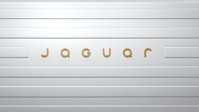
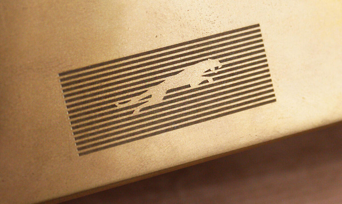
New Jaguar Logo
The New Jaguar Logo: A Bold Step Forward or a Misstep?
October 2024 sees a new look for the Jaguar, one of the most iconic British luxury car brands. The radical change in identity is part of the wider metamorphosis of the company, aligning with ambitious plans to become an all-electric brand by 2025. Reactions toward the new logo design have been mixed, just like any change to such an iconic name in the automobile world. Some people view it as bold and much-needed modernization, while others see it more questionably as an abandonment of a storied heritage.
The New Design: Simplified and Sleek
Gone is Jaguar’s old logo, which proudly sported a detailed leaping jaguar in full profile against an oval background. The new design is far more minimalistic, adopting a sleek, modern look that’s supposed to reflect Jaguar’s electric future. The updated logo features a stylized, simplified image of the leaping jaguar-now more geometric and angular in shape-without the oval or accompanying typeface. The new emblem is flat and monochromatic, miles away from the metallic 3D effects of previous logos. This cleaned-up design is supposed to reflect Jaguar’s shift away from combustion engines and toward a more futuristic, electric range of vehicles.
The Argument For the New Logo
One of the key reasons supporters of the new logo herald it is because it visually communicates the brand’s forward-thinking strategy. The automotive sector in recent times, especially the luxury category, has been undergoing a sea change toward electrification, led by brands like Tesla, Audi, and Porsche. Jaguar is known for its high-performance sedans, SUVs, and sports cars; it wants a relevant presence in the changing landscape.
The new logo, done in a minimalist style, reflects Jaguar’s intention to affiliate itself with modern technology and sustainability. The more angular and abstract depiction of the jaguar is sleeker and more aerodynamic in form and could be interpreted as symbolic of speed and performance that have always formed the core of Jaguar’s brand identity. In this sense, the new logo represents the reinvention of the brand to match its ambitions for the latest electric vehicles that are powerful and at the same time sustainable.
Besides, the simplicity of the design makes it highly adaptable to a variety of platforms, especially digital ones, where clean, flat designs tend to work better than intricate and detailed ones. In today’s world, where brand logos adorn everything from websites to social media avatars, the flat, stylized jaguar could be instantaneously recognizable, even at smaller sizes or on digital screens.
Moreover, the move to a more simplified logo is part of a wider trend toward simplicity in creative branding across numerous industries. Other brands, such as Apple, Google, and even major car manufacturers like Audi, have moved to minimalist designs that privilege clarity and immediacy over ornate detail. Within this context, the new Jaguar logo can be regarded as part of this wider shift toward simplicity and efficiency.
The Argument Against the New Logo
However, the new logo has not been universally well-received. Detractors argue that the simplification of the emblem erodes the rich heritage of the Jaguar brand, which has always been defined by its elegance, performance, and luxurious craftsmanship. The previous logo, with its detailed depiction of the leaping jaguar, was a powerful representation of the brand’s identity: a combination of grace and strength. By flattening and abstracting the image, critics argue that Jaguar risks losing some of the premium aura that has been integral to its appeal for decades.
In particular, the removal of the oval, which once provided a sense of cohesion and balance around the leaping jaguar, is seen as a significant departure from tradition. The oval shape had been an iconic part of Jaguar’s identity since the brand’s inception, and its removal is seen by some as a jarring break from its legacy. For many Jaguar enthusiasts, the logo represented not just a brand but a symbol of British automotive excellence. The new design, with its stark simplicity, may feel too impersonal or “generic” for a company with such a rich history.
Some also worry that the new logo, while modern and sleek, may lack the distinctive character that made the previous emblem so recognizable. By moving toward a design that is both abstract and minimalist, Jaguar risks blending in with other high-end automakers that are also opting for cleaner, simpler logos. The leaping jaguar itself, now more geometric, may be harder to distinguish from the logos of other performance brands, losing some of its visual impact and uniqueness.
Another concern revolves around the timing of the redesign. The luxury car market is undergoing a profound transformation, but Jaguar’s rebranding coincides with a period of uncertainty as the company shifts to an all-electric lineup. Some argue that this logo change could be seen as a distraction or an unnecessary move during such a crucial time for the brand’s future. Rather than focusing on a new logo, critics contend that Jaguar should be prioritizing the development of its electric vehicles, ensuring they meet the performance, quality, and sustainability standards expected by consumers.
The Broader Context of Rebranding
Jaguar’s logo change is not an isolated incident in the automotive industry. Many car brands, especially those transitioning to electric vehicles, have undergone similar transformations. Mercedes-Benz, for example, also simplified its logo to emphasize a modern, futuristic image. Likewise, BMW’s shift toward a more minimalistic design for its i-series electric cars reflects an ongoing trend in which legacy car brands are reinventing themselves to stay relevant in the age of sustainability and technological innovation.
These changes are not just cosmetic; they represent a deeper shift in the brands’ values and goals. For Jaguar, the transition to an all-electric future is about more than just new cars—it’s about redefining what the brand stands for. By adopting a new logo, Jaguar is signaling that it embraces the future while still attempting to honor its past.
Conclusion: A Step Forward, But Not Without Controversy
With its bold simplicity and futuristic edge, the new Jaguar logo is clearly an attempt to modernize the brand and make it more relevant in the electric age. While many see this as a necessary evolution, others feel that the rebranding risks alienating long-time fans and diluting the brand’s heritage.
Ultimately, whether the new logo will resonate with consumers in the long run remains to be seen. Jaguar’s success will depend not just on the design of its logo but on the quality and performance of the electric vehicles it produces. If the cars live up to the promises of innovation, sustainability, and luxury, the new logo may become a symbol of a bright future for the brand. However, if Jaguar fails to live up to these expectations, the logo could serve as a reminder of a missed opportunity to maintain its storied legacy.
In the end, Jaguar’s rebranding is more than just a change of logo—it’s a reflection of the brand’s evolving identity in a rapidly changing world. Whether that evolution is successful will depend on much more than the emblem on the front of its vehicles.
With mobile users increasing every day, it’s the right time to move to responsive web design to ensure your site performs well across all devices.
To align with its new modern and electric-focused brand identity.
The leaper is now flatter, cleaner, and more minimal with a modern wordmark.
It looks fresh, digital-friendly, and matches Jaguar’s future direction.
They feel it removes the classic, detailed look that represented Jaguar’s heritage.
- The Team
- Mobile App Development
- Digital Marketing
- DevOps
- Creative Branding
- Ecommerce Development
- Web Design & Development