- Services
- Web Design & Development
- Ecommerce Development
- Creative Branding
- DevOps
- Digital Marketing
- Mobile App Development
- The Team
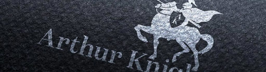
21 steps to the perfect logo design
Designing a logo may seem like an easy process, but the best logos take time. If you’re in the process of creating a logo, you’re in an exclusive position to make a powerful impact on how customers perceive a brand. Often a logo will not be designed in one go, but a designer will create many iterations of the same rough sketch- which they refine to produce a strong final outcome.
We have broken down the key steps on how to create a logo in manageable chunks to help you deliver the best logo possible.
Let’s Begin:
1. Think about the story of your brand, where has it come from? Who started it? and the message it wants to convey. This will be key for creating your logo and the route you will take.
2. Think about your company and the image you want to portray to the general public- do you want to be fun and light-hearted or corporate and serious? This will be key to defining your target audience.
3. You will need to research your market sector and find inspiration for the logo designs you like and what you don’t like. This is vital in helping you pick a path to go down for your own logo design.
4.Brainstorm words that best describe your brand. This will help you to find better words that describe your brand. Choose the best 5-10 words as this will help further refine your logo. Using a thesaurus will be really helpful in this step.
5. With the words you have selected, sketch out some rough concepts, this could be shapes or simply laying out where text elements may end up. Do not get frustrated if you are not happy with these early sketches- keep refining and use older outcomes to create new ones. This should be a free and simple process that you enjoy.
6. Create rough logos and styles that are scalable and will not lose quality when scaled up or down, this is important when designing for print, web, and mobile. This could affect how you design your logo.
7. Colour is just as important as the name of your brand, so you need to do your research – look at colours that best promote your brand, for example, red is symbolic with danger but can also mean love. Selecting the right colours for your logo will help it to stand out and attract new audiences.
8. You need to find colours that complement each other. You will need to be aware of colour trends that are currently being used in your respective sector. As a rule of thumb, we recommend that you don’t use more than 3 colours. Colour will add personality to the logo so you need to make sure you get this step right.
9. Now you have found your new colour palette, apply this to the logo’s you have sketched out, this will you give you a sense of balance and weight as you further develop your new logo.
10. We now have our preliminary logos and colour palette nailed down, so you are going to have to test the new concept on people to see which ones work best and ditch the ones that don’t.
11. Take feedback and don’t be offended- honest opinions will help make your logo stronger.
12. Refine the final sketches, take the ones that worked and make them stronger, create variations, play with the colours. As later you will need colour variations to suit the demands for your logo.
13. When refining your new logos, try and create different layouts, create a centred logo alignment and one landscape- composing the logo this way will help you greatly when using different layouts in the future. (insert images here)
14.Now comes the fun part, you can start designing your logo in its digital vector format, programs such as Adobe Illustrator will allow you to do this and create a scalable logo that will not lose its quality.
15. Now you have your refined logo and colour scheme picked, if you are having any text in your logo you will need a typeface that best represents you as a brand. This typeface will also need to be legible.
16. The best way to do this is to look at a font library- type in the name of your brand and flick through and find the typefaces you think the best suit your brand. Make sure you check the usage rights.
17. Now you will need to compose your typeface and symbol together. Take your time during this process and find the placement for your typography- remember scalability.
18. Now you have your final logo designed, scale it up and down, see if it is still legible and if you can make out the finer details.
19. Print your logo off, see how it prints and if the colours you have selected work well together. Do the same for web, upload it to social media accounts and start creating your brand awareness.
20. The most important step- take your time do not rush your logo as it can last you decades and become iconic to you and your brand.
21.File, Save, Exit.
Rak Design (UK) Ltd is a creative graphic design & web design agency, based in Northamptonshire, delivering website design and development, digital marketing and corporate branding services that drive tangible and measurable results for your business. If you’d like to learn more about our branding services or view some of the projects we’ve completed, feel free to get in touch. You can call our team on 01933 678 522 or complete our online contact form, and we’ll be happy to help.
Junior Web Developer Vacancy – Join our creative team as a junior web developer and grow your career.
- The Team
- Mobile App Development
- Digital Marketing
- DevOps
- Creative Branding
- Ecommerce Development
- Web Design & Development